Website Layout Ideas for Beginners: Build Clean Site Without Getting Stuck
What’s the first thing people notice when they land on your website? The layout.
Whether you're building a personal portfolio, a business homepage, or a landing page for your side project, your website layout can either invite users in—or leave them confused. But if you’re just starting out, designing a site can feel overwhelming. Where do the images go? How big should the headline be? How do you even start?
Take a breath. You don’t need to be a professional designer to create a layout that looks clean, feels intuitive, and works for your audience. This guide walks you through the basics—from simple layouts to high-performing landing pages—with real-life examples, visual tips, and no complicated jargon.
We’ll explore five types of layouts, beginner mistakes to avoid, and answer the most common layout questions so you can design with confidence. Let’s dive in.
Start Simple: Why a Simple Website Layout Works Wonders
Keyword: simple website layout
When you're new to building websites, it’s tempting to throw in everything—pop-ups, animations, image sliders, multiple menus. But simplicity is your best friend.
Think of your website like a small, cozy coffee shop. When the tables are spaced out, the lighting is soft, and the signs are clear, customers feel welcome. A simple website layout does the same for your visitors.
What does a simple layout usually include?
-
A logo and top navigation
-
A hero section with your main message
-
One main content area (text + image or grid)
-
A call-to-action (CTA)
-
A footer with links or contact info
Beginner Scenario: You’re creating a portfolio site. A clean layout with your name at the top, a short “About Me,” a few project thumbnails, and a “Contact Me” button is more than enough to start.
Simple Design Checklist:
-
Stick to 1–2 fonts and 2–3 primary colors
-
Use white space to guide the eye
-
Avoid cluttering each section
-
Make sure buttons are easy to find and read
📌 Swap the phrase:
“I want to show everything at once” → “Let me highlight one thing at a time.”
Common myth: “The more features I add, the better it’ll look.”
Truth: Simplicity builds trust, improves usability, and loads faster—especially on mobile.
The Best Website Layouts Have These 5 Core Elements
Keyword: best website layout
Some layouts just feel right—they’re clean, consistent, and easy to explore. That’s because they follow patterns users already know and expect.
Think of your website like a well-organized workspace. You know where everything is, and there’s a flow to how you move through it. The best website layout guides your visitor from curiosity to action.
5 Essential Website Layout Sections:
-
Header – Site name/logo + top navigation
-
Hero Section – A large intro with an image or headline
-
Main Content – Text, visuals, grids, or key info
-
Call-to-Action (CTA) – Buttons like “Shop Now,” “Book a Call”
-
Footer – Contact, links, newsletter sign-up
Beginner Scenario: You’re launching a small online business. A layout with a hero banner, a few product highlights, testimonials, and a strong CTA like “Start Shopping” makes the site feel both professional and approachable.
Keep in mind:
-
Your CTA should stand out but not feel aggressive
-
Use consistent spacing and section padding
-
Break up long text with visuals or dividers
What to skip: Don’t overload your footer with 20+ links. Focus on essentials like About, Contact, and Social.

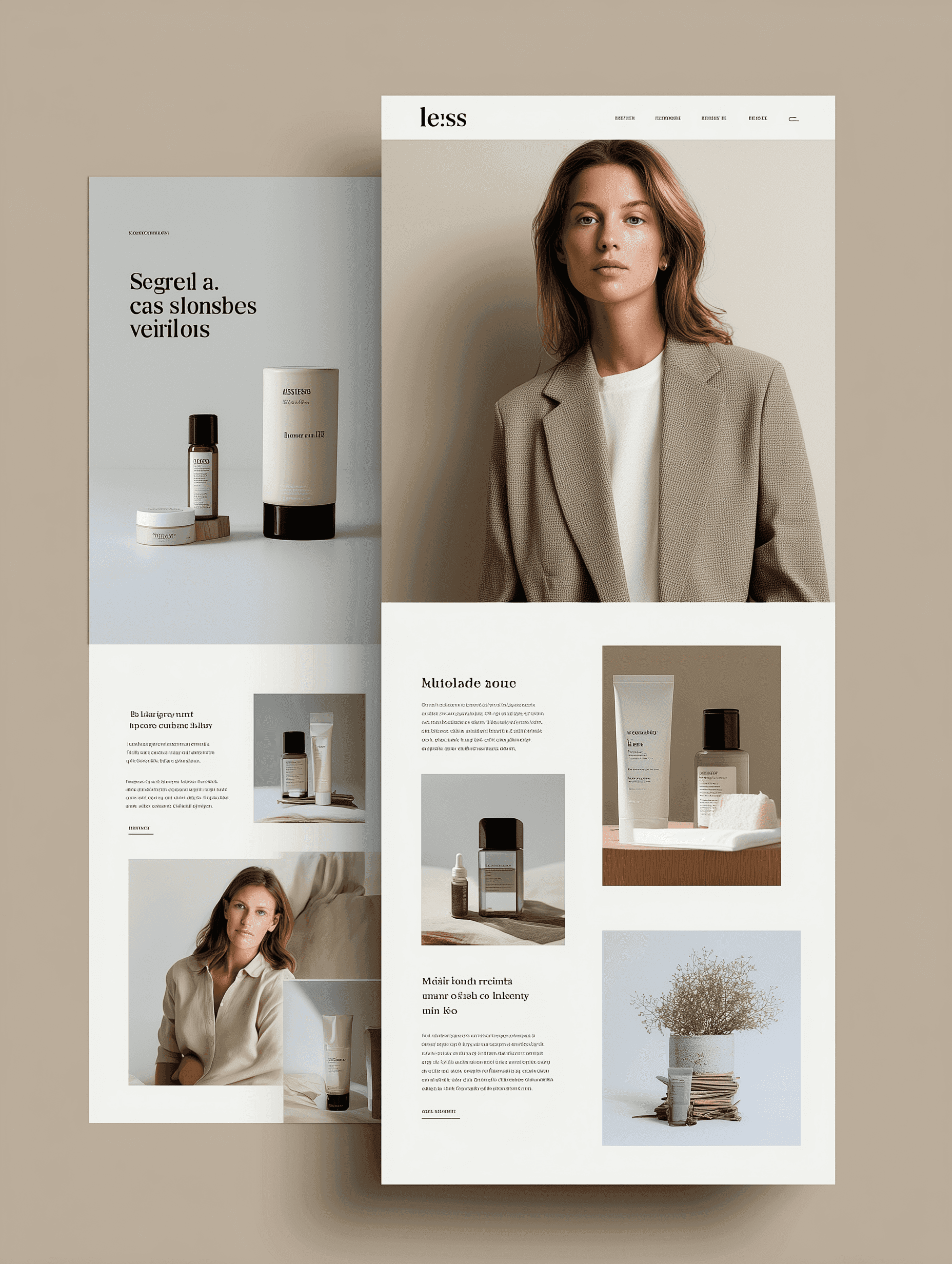
Homepage Layout Ideas That Make Great First Impressions
Keyword: homepage layout examples
Your homepage is the front door to your digital space. It sets the tone and builds trust in seconds. The goal? Show who you are, what you do, and how to get started.
A great homepage layout welcomes users and gives them just enough information to keep exploring—without overwhelming them.
Must-Haves for a Homepage:
-
An attention-grabbing headline or tagline
-
A clean hero image or short video
-
Clear navigation to explore deeper
-
Highlights of key content (services, blog, products)
-
Testimonials or social proof
Beginner Scenario: Let’s say you’re creating a blog on wellness. Your homepage could feature a calming image, a line like “Simple ways to feel better every day,” followed by your latest posts and an email signup.
💡 Metaphor: Your homepage is like a first date—it should be honest, warm, and clear about what you’re offering.
Avoid vague CTAs like “Click Here.” Instead, try:
-
“Get My Free Guide”
-
“See My Work”
-
“Join the Community”
Website Layout Ideas for Landing Pages That Convert
Keyword: landing page layout
Landing pages aren’t homepages—they’re focused pages built for one goal: conversion. That could mean collecting an email, promoting a product, or getting users to register for something.
Think of a landing page layout like a one-track path with no exits. The only way forward is the action you want the user to take.
Key Elements for a Conversion-Ready Landing Page:
-
A bold, benefit-driven headline
-
A visual (image, mockup, or demo)
-
Supporting copy: What’s in it for the user?
-
One clear CTA button (no menus!)
-
Optional: Reviews, testimonials, or guarantees
Beginner Scenario: You’re promoting a free course. Your landing page should include:
-
Headline: “Learn Web Design in 7 Days”
-
3 bullets on what they’ll gain
-
A form with one CTA: “Enroll Free”
✨ Sensory tip: Use images that show transformation—before/after, happy customer, or the product in use.
Don’t fall for this: Adding extra menus, links, or distractions. One CTA. One goal.
Creative Website Layout Ideas to Inspire Your Design
Keyword: website layout ideas
Not every layout has to follow a cookie-cutter pattern. Once you understand the basics, it’s fun to experiment. Some of the most inspiring websites bend the rules—with purpose.
Examples of Creative Layout Approaches:
-
Asymmetry – Creates visual interest (great for creative portfolios)
-
Split screens – Showcase dual features or side-by-side comparisons
-
Story-based scrolling – Reveal a story or product step by step
-
Bold typography – Let words be your design element
Beginner Scenario: A musician designing a portfolio site might use a scrolling layout where each track fades in as you scroll, paired with lyrics and stories behind the songs.
🎨 Reminder: Creativity ≠ chaos. Make sure your layout still supports readability and usability.
Quote to carry:
“Design isn’t just what it looks like and feels like. Design is how it works.” – Steve Jobs
Avoid copying trendy layouts if they don’t fit your content. Adapt ideas—don’t adopt blindly.
Beginner Mistakes to Avoid When Designing Layouts
Learning by doing is great—but let’s skip a few common roadblocks.
Common Mistakes:
-
Overcrowding: Too much info in too little space
-
Ignoring mobile view: A layout that breaks on phones loses visitors
-
Too many styles: 4 fonts, 5 colors, 6 button shapes = chaos
-
No clear path: Users don’t know what to click next
Do this instead:
-
Leave breathing room between elements
-
Test your design on multiple devices
-
Stick to 1–2 fonts, a cohesive color palette
-
Use clear CTAs to guide your user journey
Frequently Asked Questions
1. How do I choose the right layout for my website?
Think about your goal. Are you showing a product? Sharing knowledge? Promoting an event? Your layout should support that. For example, a blog might use a card grid, while a product page might use side-by-side visuals and buy buttons.
2. What’s the difference between a homepage and a landing page?
A homepage is a general welcome page that introduces your brand and lets users explore. A landing page is focused on one action—like signing up, buying, or downloading—without distractions.
3. Do I need to be a designer to create a website layout?
Not at all. Tools like Wix, Framer, and Webflow offer templates you can start with. Figma is great if you want to sketch things out first.
4. What’s the easiest way to start designing my layout?
Start on paper or use a free wireframing tool. Sketch a simple header, body, CTA, and footer. Then build it in your website tool of choice. Don’t overthink it—clarity beats complexity.
Conclusion: You’re Ready to Design with Confidence
Let’s recap:
-
A simple website layout helps you focus on what matters
-
The best layouts follow a pattern users trust—hero, content, CTA
-
Homepage layout examples show how to make a great first impression
-
A solid landing page layout converts attention into action
-
Don’t be afraid to try creative website layout ideas—just keep usability in mind
Every great website starts with a layout. Keep it simple. Make it purposeful. And let your message shine.
Next Step?
Choose one layout type from this post and sketch it. Just start. Then build it using your favorite tool or even with pen and paper first.
You already have the vision, now it’s time to design it.
Let me know if you’d like a Pinterest pin version, Medium publishing format, or a PDF for download. I can also help you write image alt text for your 2–3 layout examples to boost accessibility and SEO.